top of page

the blinking bottle wine company
A Branding & Packaging Speculative Design Project

Creating a conceptual wine brand that merges bold typography and whimsical character design. Also using anthropomorphism as a storytelling tool to add character and approachability, whilst still maintaining a slick and stylish aesthetic. This project focuses on branding, illustration, and packaging design, aimed at young professionals.
The Challenge
To create an eye-catching wine label inspired by Contemporart design, aimed at young adults
Research & Inspiration


This photograph reminded me of 1970s lava lamps


An old drawing of mine which inspired me to go down the anthropomorphic route
Pinot Grigio research


The lava lamps steered me in the direction of 1970s ads and overall aesthetic

Inspiring wine label/branding designs
Pinot Noir research
Key words - 1970s/retro, anthropomorphism, gradients/ombre, light & dark, trendy
The Design Process
Colour Palette
Pinot Noir Poster

Pinot Grigio Poster
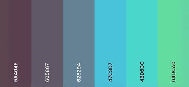
Choosing colours that reflect the flavour profile of each wine - crisp, earthy colours for Pinot Grigio, bright, fruity colours for Pinot Noir. In addition, accent colours from each palette are used in in the opposing design to pull the poster designs together.
Typography

Primary Font - Evokes 70s psychedelic feel, adding whimsy & motion. The large & bold nature of the font draws attention to the brand name.
graphics

Secondary Font - Hand-drawn by me, lending an organic and playful quality to the design. Pairs well with the primary font due to the blending of nostalgia and contemporary design. Also adds a more casual feel to the composition.


Initial Designs
Final Graphics


Utilising gradient, blending and multiplying tools for a fluid and slightly psychedelic look
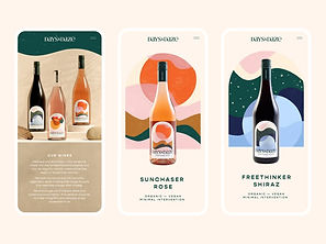
Final outcome


bottom of page