top of page

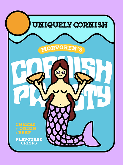
Morvoren's Cornish Crisps
A Branding & Packaging Speculative Design Project

Inspired by Cornish folktales, specifically the Mermaid of Zennor. Bold colours, flat shapes, and simplified scenery inspired by the coast of Cornwall, while 'Morvoren' is the Cornish word for mermaid. This project focuses on branding, illustration, and packaging design, aimed at a Gen Z and Millennial demographic.
The Challenge
To create a Gourmet crisp brand inspired by Cornish Folklore, using whimsical Visual story-telling
Research & Inspiration


Iconic Cornish Folktale
Inspiring Crisp packet designs

1960s packaging designs


Cornish coast
The Mermaid Chair, Zennor


Classic Cornish foods
Travel Poster
Key words - retro, flat, lines, bold, mermaid, coast, sea
The Design Process
Colour Palette

Base colours - represent sun, sea, sky
Secondary colours - change based on flavour, add a more whimsical touch
Typography


Header Text - retro, standout, contains curved shapes which can be warped while maintaining font's aesthetic
Body Text - Still has retro feel but more practical, so ideal for info such as ingredients. Grounds the header font.
graphics
Initial Designs and Sketches


Bold linework and block colour, inspired by 60s design


Final outcome

Final Illustrations


OOH Design example


bottom of page