top of page

Vicki Doll's blind boxes
A Packaging & Product Speculative Design Project

Creating a custom line of dolls inspired by past exhibitions at the Victoria and Albert Museum in London. Presented in the popular 'blind box' format, this product is aimed at those with a love for history, pop culture, and the blind box craze that has taken social media by storm.
The Challenge
To create a line of blind box Dolls inspired by past exhibitions at the v&A museum
Research & Inspiration

Beatrix Potter's beloved & nostalgic illustrations offer clothing ideas
1960s fashion = endless inspiration! Plus Mary Quant had a fashion doll line...
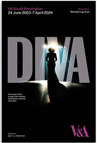
The Diva exhibit - also full of eye-catching unique looks
Blind box packaging research -products on side, bright colours, hero image
Research into art toys & blind boxes
The 'David Bowie Is' - full of iconic looks that would translate well to a doll design


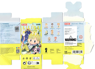


Further packaging research - one of my fave Pop Mart collections. Fun concepts and visuals, all elements so well thought out
Researching the location where the products would be sold (aka the V&A Giftshop). How would the product match the existing aesthetic but still stand out? How to become a unique item but still be a feasible item for the shop to sell?
Key words - Museum, fashion, playful, Historical, engaging, collectible
The Design Process
Colour Palette

Using pastel blue and pink as the primary colours for the packaging. When paired with the bold, graphic illustrations it generates a fun yet sophisticated feel. Plus, the overall aesthetic is one of whimsy & intrigue, values that I feel match the V&A.
Typography

The font is the perfect blend of retro and contemporary, so I stayed within the font family for both primary and secondary fonts. Bold for header, light for body.
graphics


Initial designs & sketches
V&A Building Facade - Alternative colour way
Distinct yet cohesive doll designs, balance of stylisation and recognisability. Consistent facial features = unified identity.
Descriptions of each doll's corresponding exhibit
V&A Building Facade - pink colour way (main)
Final graphics
Final outcome


bottom of page